How time and space can heal: memory and trauma in post-war Japanese art

Not only does war destroy property, kill people, and injures them, it drives them out of their minds. That’s what war is all about. That’s what I learned from painful experience …
There is nothing glorious about war.
Whether you win or lose, it is nothing but emptiness, anger.

Toshiko Saeki, Hibakusha Testimony. Accessed 8 October 2022. http://www.pcf.city.hiroshima.jp/virtual/VirtualMuseum_e/visit_e/testimony_e/testimo08.html
 Chim↑Pom, Making the sky of Hiroshima“PIKA!” 2009. video (5’ 35”), lambda print (66.7×100cm). Photo: Bond Nakao.
Figure 1: Chim↑Pom, Making the sky of Hiroshima“PIKA!” 2009. video (5’ 35”), lambda print (66.7×100cm). Photo: Bond Nakao. Courtesy of the artist and MUJIN-TO Production. Accessed 8 October 2022. http://chimpom.jp/project/hiroshima.html

Trauma, Eva Hoffman says: “is the contemporary master term in the psychology of suffering, the chief way we understand the personal aftermath of atrocity and abuse,” and it may also be “our psychological culture’s name for extreme suffering, derived from our way of deciphering the self… the language of depth psychology … through which we have come to interpret the affective aftermath of atrocity.”

Survivors of atrocities are said to “have been traumatised,” and as such struggle with memory and forgetting and how to come to terms with the trauma and find ways to continue with their lives. These first generation survivors are scarred by their experiences, with their wounds also being passed to subsequent generations, where Hoffman tells us that their “legacy … [is] not a processed, mastered past, but the splintered signs of acute suffering, of grief and loss.” In “The Generation of Post-memory”, Marianne Hirsch describes this sense of trauma being passed down through the generations as “post-memory”, which “describes the relationship of the second generation to powerful, often traumatic, experiences that preceded their births but that were nevertheless transmitted to them so deeply as to seem to constitute memories in their own right.”

There have always been artists who respond to historical atrocities both as survivors and witnesses; in his article “Mutually Assured Decorum”, Ashley Rawlings describes the work of a number of mostly Japanese artists responding to the bombings of Hiroshima and Nagasaki in 1945, events which led to the surrender of Japan and the end of the fifteen-year Pacific War. Rawlings opens with the controversial artwork called Making the Sky of Hiroshima “PIKA!” (orピカッ!) by the artist group Chim↑Pom, staged in 2008 for Hiroshima MOCA which was said by the group to be an artistic “call for peace.” (see figure 1).

The public response to the incident, particularly from the Hiroshima community, was “sharp criticism and condemnation,” where critics said the work “crossed the line of decency” because “pika” referenced “pikadon,” a mimetic word created by the hibakusha , “who had not known even the word ‘atomic bomb’ at the time, expressing what they experienced in the explosion with ‘PIKA’ as the flash and ‘DON’ as the roaring blast that followed” the sound ‘PIKA’ came to stand for the A-Bomb” , the artwork was therefore synonymous with the atomic blast.

Following the PIKA incident Takao Shimamoto, Director General of the Citizens Affairs Bureau for the City of Hiroshima, commented, “This work of art, a jarring reminder of the atomic bombing, is distressing to many citizens of Hiroshima, and particularly the A-bomb survivors. Such works must not be tolerated and must be apologized for sincerely.” This apology duly came on 22 October 2008, when the director of Hiroshima MOCA, Dr Yasuo Harada, released an apology for the controversial piece, and in a televised press conference at Hiroshima City Hall on 24 October 2008 stated: “The museum would like to apologise on behalf of a staff member who failed to stop the artists from an act that went too far while she was involved in observing it.”

At the same press conference, the leader of Chim↑Pom, Ryuta Ushiro, said:
“We would like to carefully consider how to best express our regrets to the Hiroshima community… I know what we did for our art is controversial and it upsets me if this has hurt the feelings of hibakusha. Our aim, though, was to capture the attention of young people, who haven’t experienced war.”
Rawlings asserts that the “codes of decorum… in Hiroshima, at least, are firmly entrenched” (Rawlings: 97) especially by the hibakusha, but points out that in the “relatively neutral spaces… outside of Hiroshima and Nagasaki,” artists seem to be more free of such constraints, with “Post-war Japanese art and pop culture being full of references to Japan’s nuclear experience, ranging from the reverent to the absurd.”

Iri and Toshi Maruki. Hiroshima Panel I Ghosts. 1950. Sumi ink, charcoal or conté on paper. 180 × 720 cm.
Figure 2: Iri and Toshi Maruki. Hiroshima Panel I Ghosts. 1950. Sumi ink, charcoal or conté on paper. 180 × 720 cm. Maruki Gallery, Higashi-Matsuyama city, Saitama, Japan. Accessed 8 October 2022. https://marukigallery.jp/en/hiroshimapanels/

The Hiroshima Panels (Figure 2), a series of fifteen large painted panels measuring 180 centimetres high by 720 centimetres wide, by the artist couple Iri and Toshi Maruki, were the result of over thirty years of collaboration which began soon after they travelled to Hiroshima in 1945, shortly after the bombing, to assist relatives who had survived the nuclear attack. This “haunting series of expressionistic paintings” viscerally depict the aftermath of the war, where they “painted some nine hundred human figures” for the first painting alone, saying:

We thought we had painted a large number, but as many as 140,000 people died in Hiroshima. As we continued painting, praying for the souls of the dead in the hope that it will never happen again, we realized that even if we painted all our lives, we could never paint them all. One atomic bomb in one instant caused the deaths of more people than we could ever portray. Longlasting radioactivity and radiation sickness are causing people to suffer and die even now. This was not a natural disaster. As we painted, through our paintings, these thoughts ran through our minds.

Iri and Toshi Maruki

As Rawlings noted, other Japanese artists did have a more “emotionally detached approach”, giving examples such as Satoshi Furui’s “photorealistic oil paintings of mushroom clouds” (Figure 3) which highlight “the paradox of the beauty in such destructive power.” This sense of the destructive power and beauty of the atom bombs crept into popular culture, where “themes of terror, monsters and mutation” run through many films of the 1950s and 1960s, such as those by the Toho Company, including Godzilla (1954) in which a nuclear test awakens the giant fire-breathing monster from its slumber in the sea and incites it to rampage through Tokyo, and Matango (1963), also known as Attack of the Mushroom People or Fungus of Terror, where a ship is wrecked on the island of Matango, an island used for nuclear testing, and as the film unfolds the survivors consume the mushrooms growing on the island, finding themselves slowly mutating into grotesque fungal creatures and turning against each other.

Satoshi Furui. Mushroom cloud #2001 - Hardtrack I oak. 2003. Oil on panel. 180 x 170 cm.
Figure 3: Satoshi Furui. Mushroom cloud #2001 – Hardtrack I oak. 2003. Oil on panel. 180 x 170 cm. Accessed 8 October 2022. http://www.artnet.com/artists/satoshi-furui/mushroom-cloud-2001-hardtrack-i-oak-slMYDlIjKZt9hxhc6fCTTA2

Time Bokan was a TV series that ran from 1975 to 1976 for sixty-one episodes. In the series the central character is the inventor of a time-travel machine, and he finds himself lost on a test run of the machine in the prehistoric past. Rawlings describes the end of each episode of Time Bokan as treating the atom bomb in a “more comical manner” where the “final eruption of a skull-faced mushroom cloud signalled the villain’s death.” Further towards the end of the 20th century, depictions of “futuristic scenes of a post-apocalyptic Tokyo” have appeared in anime such as Katsuhiro Otomo’s Akira (1988) and Hideaki Anno’s Neon Genesis Evangelion television series (1995-96). Japanese film, TV and anime, including many remakes of these original films and series, continue these themes into the twenty-first century.

Japanese artist Takashi Murakami “responded to this conflation of Japanese wartime history with pop culture” in his own series of paintings, also titled Time Bokan (from 2001), which “depict the same skull-faced mushroom clouds as the original anime series, but with rings of smiling flowers in their eyes.” In 2005, at the New York Japan Society, Murakami delved further into the nation’s underlying nuclear anxiety when he curated the exhibition “Little Boy: The Arts of Japan’s Exploding Subculture,” which covered everything from Godzilla figurines to Hello Kitty, and showcased the work of ten contemporary Japanese artists.

Writing in the Little Boy exhibition catalogue, Murakami suggests that the “post-war kitsch and childlike aesthetic of Japanese pop culture” is:

the product of generations struggling to internalize and rationalize the unprecedented trauma of the atomic bombings followed by the United States’ 1945-52 occupation of the country, which infantilized the Japanese people… It would not be an exaggeration to say that the American-made constitution prevented the nation from taking an agressive stance, and forced the Japanese people into a mindset of dependency under the protection of America’s military might.

Takashi Murakami

Murakami is critical of the situation where, after WWII, demilitarized Japan experienced a “collective sense of helplessness,” with the metaphor of Japan as the little boy is intended to critique the country’s supposedly unavoidable reliance on its big brother, America.

Takashi Murakami. Eco Eco Rangers Earth Force. 2005. Banner wrapping
Figure 4: Takashi Murakami. Eco Eco Rangers Earth Force. 2005. Banner wrapping the facade of Japan Society. Digital print on mesh vinyl. approx. 29 x 13 m. © 2005 Takashi Murakami/Kaikai Kiki Co. Ltd. All Rights Reserved. Photo by Tom Powel Imaging, New York. Accessed 8 October 2022. https://www.asianart.com/exhibitions/littleboy/12.html

The name Little Boy, of course also references the code name used by the American military for the atomic bomb dropped on Hiroshima in 1945, and Murakami argues that “proliferation of ‘cuteness’ in Japanese contemporary art, which draws upon youth culture, especially otaku culture, evinces a common urge among the post-war generation in Japan to escape from their horrible memories and sense of powerlessness.” As Rawlings points out, “issues of infantilism aside, there is no doubt that Murakami’s idea is based on the truth that as the first country to sustain nuclear attacks, Japan suffered an unprecedented national trauma that has been sublimated into its post-war art and pop culture.”

Dong-Yeon Koh in his article “Murakami’s ‘little boy’ syndrome: victim or aggressor in contemporary Japanese and American arts?” goes further and describes Murakami’s rhetorical analysis of Japan’s self-image as “contradictory, given his extremely aggressive business tactics, which can find no counterpart in the Western art world – not even in the efforts of Murakami’s predecessor, Andy Warhol.”

Koh and Rawlings are keen to criticise Murakami’s theory as “flawed in that it frames the atomic bombings and Article 9 solely in terms of a binary relationship with the United States, portraying Japan as the exclusive victim of World War II,”. ignoring “Japan’s invasion and occupation of numerous Asian countries between 1894 and 1945 … in the name of liberating them from Western colonialism.”

Rawlings cites The Forbidden Box (1995) (Figure 5) by Hiroshima-based artist Yukinori Yanagi as an example of artwork that engages directly with Article 9. The Forbidden Box comprises iris and silkscreen prints on two nylon voile panels, each with a faded image of a mushroom cloud, overlaid with the original and later versions of Article 9, flowing out of a lead box, which has “Little Boy” engraved on its lid.

Figure 5: Yukinori Yanagi. The Forbidden Box. 1995. iris print and silkscreen on nylon voile fabric, lead box (fabric)518.0×294.7 cm, (box)61.0×91.5×61.0cm. Accessed 8 October 2022. http://www.yanagistudio.net/works/projectarticle902_view_eng.html

Before Japan’s surrender, Emperor Hirohito was seen as a direct descendent of the sun goddess Amaretsu, the most important Shinto deity; therefore, six days after the second bomb, at Nagasaki, when at noon on 15 August 1945, Hirohito announced Japan’s surrender on public radio, this was the first time the Japanese public had heard the Emperor speak, “and the realization that he was human came as an immense shock” to the people of Japan, and in 1946, on 1 January, Emperor Hirohito formally renounced his divine status in an “imperial rescript.”

The translucent layers of Yukinori Yanagi’s The Forbidden Box (Figure 5) can be seen as presenting viewers with “a visualization of the ambiguities in the pacifist ideology that redefined Japan’s position in the world.” The Forbidden Box alludes to the Greek myth of Pandora’s Box, as well the to the Japanese folk tale, Urashima Taro: in both stories the opening of the box spells chaos and trauma, and tellingly, with Taro the fishermen, when he opens the box “a white cloud emerges, causing him to age instantly and die” – the white cloud that ages Taro can be read as “the atomic cloud that rendered the emperor human.”

Although the atomic bombings are a pervasive theme in Japan’s visual arts, and have clearly conditioned much of post-war artistic production, they were only one of many issues confronting Japanese artists in the aftermath of World War II, and “should not be regarded as the single point of departure for all subsequent artistic and cultural expression in Japan.”

Japan has fallen victim to many disasters before and after the bombings, both natural and man-made, the latter from internal as well as external forces. Namiko Kunimoto in her book The Stakes of Exposure opens with documentation of the Minamata disaster which “unfolded across different media in a manner that heightened anxieties about bodily exposure in post-war Japan.” Kunimoto gives the poignant and pointed example of Kuwabara Shisei’s photo, Ikeru ningyō (A Living Doll), circa 1962 (Figure 6), which shows a young girl named Matsunaga Kumiko, who contracted mercury poisoning disease at the age of six, and died soon after.

Figure 6: Kuwabara Shisei. Ikeru ningyō (A Living Doll), circa 1962. Copyright Kuwabara Shisei. In Namiko Kunimoto. The Stakes of Exposure: Anxious Bodies in Post-war Japanese Art. Minneapolis: University of Minnesota Press, 2017. Kindle Edition. location 406.

The documentation by photojournalist and artists at the time gradually turned public opinion from that of fear of the victims as contagion, to outrage against the company responsible for the toxic pollution over many years. Kunimoto tells us that she opened her book speaking about the tragic events in Minamata because they “exemplify the intersection of gender, the body, nationhood, and representation” she sought to examine, noting that the disaster: “fed into other anxieties circulating in Japan in the post-war period—namely, that the physical body could not withstand exposure to the ravages of modern times, be they unknown contaminants in the air and water, the nuclear weapons wielded by the United States, or rapid changes to the urban environment. Fears about bodily contamination were also linked to the arrival of the Allied Occupation forces.”

In The Stakes of Exposure Kunimoto further devoted a chapter to each of four artists active in the post-war period: Katsura Yuki (1913–91), Nakamura Hiroshi (born 1932), Tanaka Atsuko (1932–2005), and Shiraga Kazuo (1924–2008) to show other artistic responses to the trauma experienced by the people of Japan before and after WWII. Today in 2022, at almost eighty years since the end of the Pacific War, Japan is still in the midst of a “turbulent process of national self-reflection and self-recognition.” Rawlings astutely noted that “although Article 21 of the constitution asserts the people’s right to freedom of expression and forbids censorship, in practice, artists and curators in Japan have to negotiate unwritten codes of decorum when exploring the atom bombings and the broader context of the country’s wartime past.”

Figure 7: Nakamura Hiroshi, Sunagawa goban (Sunagawa No. 5), 1955. Oil on board, 92.5 × 183 cm. Copyright Nakamura Hiroshi. Courtesy of the Museum of Contemporary Art, Tokyo.

It can be said that “art is in the eye of the beholder” and artwork dealing with traumatic events is even more sensitive to this subjective assessment. In many ways reception of such work is always going to be affected by time and space. A recent case was with the harshly critical reception of a piece by the Chinese activist and artist, Ai Weiwei, where he transported 14,000 life jackets used by refugees, for display in Berlin, his aim being said to be: “a tribute to the refugees that died at sea in an attempt to escape war and poverty in the Middle East and North Africa” – an aim met with angry retorts by some critics, such as “It would have been more useful to send and distribute them [the life jackets] in north Africa.” One wonders if the modern rhetorical phrase “too soon?” might be apt, even if the critics do have a rational and reasonable point. Such reception stands in stark contrast to the sympathetic viewing of the shoes left by Jewish victims of the Holocaust, displayed at Holocaust Memorial sites, which are today seen as “touching” and “moving;” both as a memorial to the victims and a memento mori to us now. Both views show that temporal and spatial concerns can, if not necessarily heal victims of trauma, allow for a possibly different reading of artworks made in response to traumatic events.

In some respects, as Eva Hoffman says in her introduction to After Such Knowledge, as such an “immense catastrophe recedes from us in time, our preoccupation with it seems only to increase” and yet there is the danger that “temporal, geographical, cultural” distance runs risks of “simplification implicit in such remoteness.” She questions how we can “apprehend” such trauma “from our distance”, what meanings do these events hold for us, “and how are we going to pass on those meanings to subsequent generations?”

Whatever the unwritten codes of decorum, or even stated laws at the time of traumatic events and the following periods, the way artists respond to trauma seems both relevant and ever-timely in the midst of the constant tide of extreme and transient events and consequences. “As we have seen, the stakes of these events were frequently – and perhaps most powerfully – communicated through art and visual culture.”

Further reading
Atomic Bomb survivors are referred to in Japanese as hibakusha, which translates literally as “bomb-affected-people” Bob Sink. ‘Who Are The Hibakusha? | Hibakusha Stories’. Accessed 8 October 2022. https://hibakushastories.org/who-are-the-hibakusha/.
Marianne Hirsch. ‘The Generation of Postmemory’. Poetics Today 29, no. 1 (1 March 2008). https://doi.org/10.1215/03335372-2007-019
Eva Hoffman. After Such Knowledge: Memory, History, and the Legacy of the Holocaust. New York: Public Affairs, 2004.
Murakami, Takashi, ed. Littoru Boi: Little Boy, the Arts of Japan’s Exploding Subculture = Littoru Boi: Bakuhatsu Suru Nihon No Sabukaruchaa Aato. New York New Haven, CT: Japan Society, 2005.
Namiko Kunimoto. The Stakes of Exposure. University of Minnesota Press, 2017.
Ashley Rawlings. ‘Mutually Assured Decorum’. ArtAsiaPacific no. 65 (1 July 2009). https://search.ebscohost.com/login.aspx?direct=true&db=asu&AN=505255761&site=ehost-live
‘This Was Ai Weiwei’s Refugee Life Jacket Installation – Public Delivery’. Accessed 9 October 2022. https://publicdelivery.org/ai-weiwei-life-jackets/.

Art on a Postcard International Women’s Day Auction 2022

Bidding open 24 Feb – 15 March 2022

I’m delighted to take part in this year’s Art on a Postcard International Women’s Day Auction 2022.

Art on a Postcard was launched in 2014, and was then intended to be a one off secret postcard auction. However, the first edition was such a success that they have since gone on to hold further auctions each year to raise more funds for  The Hepatitis C Trust.

Artists and photographers who have taken part in Art on a Postcard auctions include Damien Hirst, Grayson Perry CBE, RA, Marina Abramoviç, Harland Miller, Martin Parr, Es Devlin, Jeremy Deller, Peter Blake, Gilbert and George, Jake and Dinos Chapman, Patrick Hughes, Wolfgang Tillmans, Marc Quinn and Cecily Brown.

100% of the money raised in Art on a Postcard auctions goes to The Hepatitis C Trust’s campaign to eliminate hepatitis C in the UK by the year 2030.

I’m so excited to join this year’s Art on a Postcard International Women’s Day Auction with a stellar line up of highly collectable female identifying artists ranging from emerging new graduates to world-renowned artists.

The 2022 participants include Charmaine Watkiss, whose work is concerned with what she calls ‘memory stories’. She creates stories primarily through research connected to the African Caribbean diaspora, and then maps the stories onto life sized figures.

New York based artist Philemona Williamson joins the line-up, her work explores the tenuous bridge between adolescence and adulthood, along with Brooklyn based Louise Lawler aiming to raise questions about the production, circulation, and presentation of art through her creations.

They will be shown alongside pieces from Sarah Ortmeyer, Allison Katz, Lara Schnitger, Penny Goring, Florence Peake and Emma Cousin for this edition.

Emerging voices will also feature offering the opportunity to spot fresh talents, such as New Contemporary 2021 Shannon Bono who is invested in producing layered, figurative, compositions that centralise black womanhood as a source of knowledge and understanding.

Also, Amanda Ba who has achieved quick success with her erotic red female figures, and depictions of animals exploring interspecies relations, queerness and cultural identity.

Original creations will also be available by Bunmi Agusto, Mandy Franca and Victoria Cantons among others.

As well these exciting additions, Art on a Postcard this year welcomes back expressionistic American artist Katherine Bernhardt and Royal Academicians Vanessa Jackson, Mali Morris and (my hero and mentor) Anne Desmet.

The Art on a Postcard women’s auctions focus on the work The Hepatitis C Trust does in women’s prisons. In 2022 The Trust will be expanding their women’s hepatitis C work beyond the prison walls into probation services and women’s centres, the money from this auction will help achieve this goal. It is  The Hepatitis C Trust‘s belief that many of the women incarcerated in the UK are there because of addiction and mental health problems and need help, not locking up.

Our prison work gives us the unique opportunity to engage hard to reach women. When these women take control of their health, often when they’ve not been in control of anything, there is a considerable knock-on effect. Accessing treatment changes their lives and can be the catalyst to getting clean and sober and into more manageable ways of life. Art on a Postcard shows these women that they are valued and cared about.

Julia Sheehan – National Female Prisons Coordinator

Bidding is now open online, hosted by Dreweatts, with each lot starting at £50


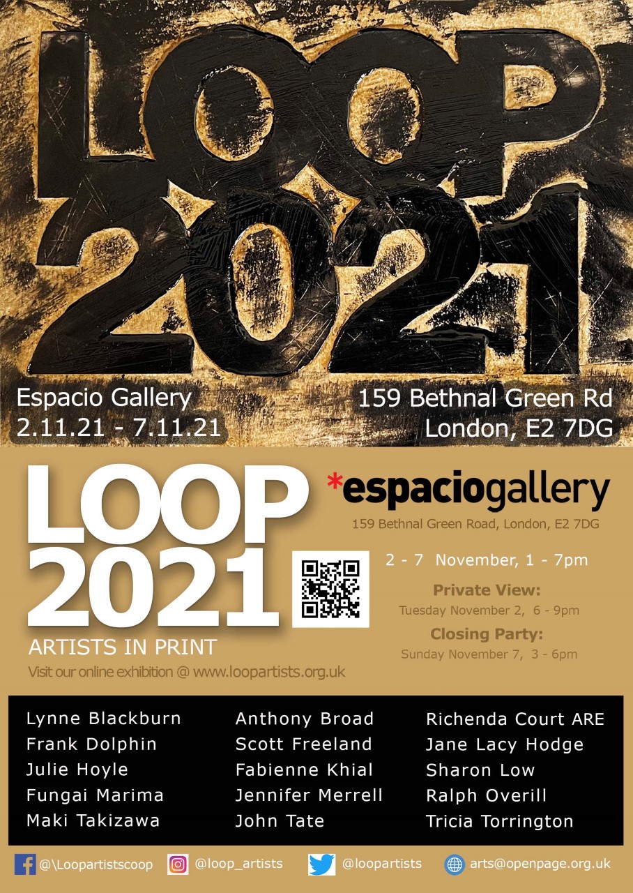
LOOP2021 – Artists in print

LOOP 2021 will be held at Espacio Gallery in November 2021!

Espacio Gallery
159 Bethnal Green Road
London E2 7D

Tue 2 November to Sun 7 November 2021
Open times Daily 1.00 pm to 7.00 pm
Private View and Meet the Artists: Tuesday 2 November 6.00 pm to 9.00 pm
Closing Party Sunday 7 November 3.00 pm to 6.00 pm
(Please note the gallery is closed on Mondays)

LOOP is a collective of nationally and internationally exhibiting artists who come together with the aim of presenting some of the best in new printmaking through yearly exhibitions. The exhibitions have been running with considerable success since 2005.

LOOP is about creative freedom, encouraging participating artists to show their individual approach in their choice of technique, from the oldest print technologies through to the most recent digital developments, presenting work in both 2D and 3D that demonstrates great diversity in imagery and practice. The work shown each year is new work, which brings a freshness and adds a progressive dynamic to the exhibition.

LOOP2021 will show work by printmakers with a wealth of experience. The core LOOP artists have MAs, mostly from Camberwell College of Art, UAL (and as usual this year we are including some more recent graduates in the mix). Amongst the group are artists who have been involved in founding print workshops, and in arranging and curating exhibitions and festivals.

Here comes the sun (little darlings) linocut by Sharon Low 2021
Image: Here comes the sun (little darlings) – linocut by Sharon Low 2021, exhibiting in LOOP2021

I am proud to be a member of this group of artists in this 16th anniversary show. Please note that the exhibition will proceed despite difficult conditions imposed by COVID-19. We have safety guidelines in place during the exhibition, which we kindly ask all visitors to observe.

Open times Daily 1.00 pm to 7.00 pm
Private View and Meet the Artists: Tuesday 2 November 6.00 pm to 9.00 pm
Closing Party Sunday 7 November 3.00 pm to 6.00 pm
(Please note the gallery is closed on Mondays)

Please click here to download an invitation to LOOP2021.

For further information please see:
arts@openpage.org.uk
www.loopartists.org.uk
Instagram: LOOP_artists
Twitter: LOOP_Artists
Facebook: Loopartistscoop
arts@openpage.org.uk

Reflections on William Kentridge


Another noted artist that I only discovered in the last few years, but whose art and ideas have greatly influenced me, is the South African artist William Kentridge.

Renowned for his animated expressionist drawings and films exploring time, the history of colonialism and the aspirations and failures of revolutionary politics, South African artist William Kentridge (b.1955, Johannesburg) featured in two major London exhibitions in the last two years that I was fortunate enough to see in the last couple of years.

The Whitechapel Gallery exhibition showcased six large-scale installations by the artist, where music and drama are ruptured by revolution, exile and scientific advancement.


Highlights included the film work Second-hand Reading (2013), installation O Sentimental Machine (2015) and The Refusal of Time (2012), an immersive work created with composer Philip Miller, projection designer Catherine Meyburgh, choreographer Dada Masilo, scientist Peter Galison and collaborators from around the world.

Marian Goodman presented two multiscreen film installations: More Sweetly Play the Dance, and Notes Toward a Model Opera.


More Sweetly Play the Dance is an eight-screen danse macabre, reminding one of the medieval tradition which summons diverse vestiges of humanity in a paradox of revelry and mourning. Kentridge presents us with part carnival, protest, and exodus: a 45 metre caravan traversing in a sphere around us with figures in procession, a form the artist invoked in his 1999 Shadow Procession.


About the processional form, Kentridge says:

“In some ways we first come across it in Plato’s Allegory of the Cave. In a prelude to talking about the responsibility of the philosopher king, he describes people walking behind a screen carrying wooden and stone objects in their hands, their shadows thrown onto the wall opposite the prisoners shackled in the cave watching the shadows.”

Kentridge manages to combine traditional media with new media in work that references much of the culture and history of humankind’s interactions with each other – my work does not of course encompass such a vast range of subjects and media, however, I have found him inspiring for what is possible.

As with Mona Hatoum, Do Ho Suh and Tatsuo Miyajima, other artists who have greatly influenced me over these last two years, I dream about the kind of work I might make that goes beyond my previous boundaries of tradition painting and printmaking, of relatively small-scale, framed works, to the ideas of truly multi-media, multi-sensory pieces and installations drawing from a myriad of sources, cultures, languages and peoples.


Links and references


Tatsuo Miyajima from 9 to 1 and zero in the cycle of life and death

In my post about the London-based Korean artist, Do Ho Suh, I talked about the importance of the notion of karma to his work. Karma is also central to the work of the Japanese artist Tatsuo Miyajima.


Miyajima’s three core concepts are:


  • keep changing
  • connect with everything
  • continue forever

These three symbolise human life and are the basis for his art.

Key to Miyajima’s practice are the numbers nine to one and zero, he says:

“Basically the count goes down from nine to one, then repeats: from 9-8-7, these numbers shine this represents life. The count continues, and as it does this symbolises change.


Then we reach zero In Sanskrit zero was call “sunya”, in Buddhism, in Japanese, this becomes kuu, “the void”.

It is said this idea originated in India in the sixth century but the original meaning  was not only emptiness or nothingness but also  swollenness an explosion.

In other words, ‘zero’ incorporates two diametrically opposed meanings: it indicates that this void is invisible, yet packed with energy.


So when someone dies, it’s like going to sleep: you can’t see anything, but there’s plenty of power there, and if you rest for a while, life reverts as though you were waking up the next morning.

TMiyajima_CounterVoice_in_Wine_at_NY

Tatsuo Miyajima: Counter Voice in Wine

This repeating cycle of life and death can be taken as the boundary of what is visible: invisible then visible, the pattern of life and death repeating. For Miyajima, that’s what it’s all about, that’s what life is.”

Miyajima doesn’t include zero in his work because it would signify death. So instead of a zero, it goes black:

“The gap between counting cycles represents a pause or breath, the ‘space of death’ before life begins once more.”

I personally found this exhibition inspiring both for the sheer scale and technical knowledge that must have been behind its staging, but even more because of the conceptual ideas behind Miyajima’s work.

This idea of the cycle of life and death, of karma, being represented by the simple idea of counting between 9 and 1 (to limit the numbers to single digits only) seems to me brilliant in its simplicity, and it can be used in so many ways. This also inspired me to think about the other textual references I could layer over my work, to represent the languages and therefore cultures that have influenced both my personal history, and that of my ancestors, but really of the history of humankind, if I can be so bold!


Links


Space and place in the work of Do Ho Suh


DoHoSuh_Floor_karma_scuplture

Do Ho Suh: Karma sculpture

DoHoSuh_RubbingLoving01

Do Ho Suh working on his Rubbing/Loving project

From work on paper and video to sculpture and immersive installation, the notion of karma is the title and subject of many works by Korean artist Do Ho Suh.

At the start of 2016, I was most fortunate to visit Singapore’s STPI on the last day of the exhibition, Do Ho Suh: New works.

This visit coincided with an important turning point in thinking about my own work, and in many ways came as a revelation to me, particularly with Do Ho Suh’s focus on the concept of karma and the notion of a global citizen with a mobile home: themes of space, place, home, karma, and the connection between the individual and the group across global cultures.

DoHoSuh_home_rainbowthread2.jpg

Do Ho Suh: home and karma based thread drawings

DoHoSuh_karma_rainbow

Do Ho Suh: Karma thread drawing

Born in Seoul in 1962, Do Ho Suh moved from his native South Korea, to study and live in New York and Paris, before moving to London, where he is now based.

Influenced by his peripatetic existence, an enduring theme of the artist’s practice is the connection between the individual and the group across global cultures.

His own feelings of loss of personal connected space, the sense of “home” and lack of centre, is obvious in his beautifully imagined and created sculptures and installations, as well as his many works on paper and video.

Suh’s Rubbing/Loving Project, as with much of his work, deals with the notion of home and homesickness; indeed, he explicitly asks what is this very notion of home and how can a person carry their home with them.

DoHoSuh_RubbingLoving04.jpg

Do Ho Suh: Rubbing/Loving project

DoHoSuh_RubbingLoving02

Do Ho Suh: Rubbing/Loving project

Do Ho Suh’s works explore the myriad of feelings associated with the immigrant experience: being dislocated, attempting to understand unfamiliar surrounding striving to create a new home.

The recent Victoria Miro exhibition, Do Ho Suh: Passages, showed some of the work Suh is perhaps most famous for: his one-to-one life-scale fabric representations of his homes.

Continuing the work of his Rubbing/Loving Project, these are at once beautiful and poignant reminders of how we all carry home or homes within us, and perhaps how we would like to carry all our homes were it possible to roll or fold them to carry with us to the next place.

DoHoSuh_house

Do Ho Suh

DoHoSuh_home_green

Do Ho Suh: Home

The multiplicity of individuality is tested through meditative processes of repetition: whether interlinked along a lattice of fishing nets, amassed into monumental tornado-like forms, absent from ranks of empty uniforms, or present in every yearbook photo taken at the artist’s high school over 60 years, the artist uses the reproduced human figure to explore sensitively, and with spectacular formal effect, the ways in which personal space inherently extends into the collective sphere.

DoHoSuh_bathroom

Do Ho Suh

DoHoSuh_running_man

Do Ho Suh: Running man

The human figure often dominates in Suh’s work: his drawings are filled with abundant references to himself and others; some are kinds of self-portraits – what he calls, “a contemplation of myself” – but he is not only looking inward at himself, but also outward: his sense of inter-connectedness with others of familial relationships in the present but also the past and future.

DoHoSuh_Floor_detail2

Do Ho Suh: Floor

DoHoSuh_Floor_detail

Do Ho Suh: Floor detail

DoHoSuh_karma_rainbow

Do Ho Suh: Karma

Though much of Do Ho Suh’s work is autobiographical: his pieces are highly informed by his personal experiences of home and migration, and the search for anchor points; this longing for home is the core of any person’s identity.

The work of Do Hu Suh raises questions that pertain to each of us in the universal human experience.

I await the Whitechapel’s July 2017 Art Night, which features Do Ho Suh, with great anticipation.


DoHoSuh_karma_juggler_blue


Do Ho Suh: Karma juggler

Further reading


Mona Hatoum’s “Measures of Distance” is a reflection of our global life

MonaHatoum

Mona Hatoum

The 2016 exhibition at London’s Tate Modern of the work of Mona Hatoum surprised and intrigued me. I knew little of her work before I saw this show, yet was sure it would be interesting and thought-provoking, as her life and ideas are of interest to me in my own work.

The artist’s biography is marked by exile: Hatoum is a British artist, born in 1952 into a Palestinian family exiled in Lebanon. For over three decades she has been creating works which ask us to re-consider how we see and understand the world, and its “notions of territory, fragility, humanity, scale and power” (Smith, 2016).

MonaHatoum_Homebound

Mona Hatoum: Homebound 2000

MonaHatoum_Hotspot_Tate2016

Mona Hatoum: Hot Spot 2013

To say that Hatoum’s work is “electrifying” is perhaps a bit corny, given the literally electric component of much of her work, but I think it is completely apt. Indeed the electric current ran through Mona Hatoum’s whole show at Tate Modern. Ever present, like a now distant, now nearer threat, the crackle and droning hum could be heard almost everywhere, emitted from Homebound: furniture and objects arranged behind a barrier of taut steel wire.

Produced in 2000, this domestic arrangement of tables and chairs, kitchen utensils, lights, cots, toys, a birdcage, are all wired-up so that an audible current surges round the room, with objects lit up in turn, “the aggressive sound amplified for our pleasure and disquiet. With Hatoum, the two are almost always twinned.” (Searle, 2016)

MonaHatoum_GraterDivide2002

Mona Hatoum: Grater Divide 2002

Homebound is just one of several “anxious interiors” in an exhibition that shows Hatoum’s oeuvre. Her 2013 piece Hot Spot presents the entire globe as a danger zone, with the term ‘hot spot’ referring to a place of “military or civil unrest”; here red neon outlines the contours of the world’s continents, showing what Hatoum describes as a “world continually caught up in conflict and unrest”(Smith, 2016).

Much of her work is darkly disturbing when you may think it will be at first glance. The over-sized, scaled-up domestic appliances of Grater Divide and Dormiente, using items such as graters and other kitchen utensils, useful and homely at their regular size, take on sinister characters hinting at torture implements when larger than human-scale.

MonaHatoum_Dormiente

Mona Hatoum: Dormiente 2008


MonaHatoum_Dormiente_detail

Mona Hatoum: Dormiente (detail) 2008


A key piece for me is Mona Hatoum’s film Measures of Distance. It speaks to me of the inter-connectedness of familial relationships across space and time. In the film, the artist’s mother is shown in close-up, in the intimacy of her shower. Fragments of Arabic script from their handwritten correspondence form a visual barrier over the image; like barbed wire, the script conceals and reveals the body speaking simultaneously of literal and implied closeness and distance, simultaneously expressing the painful distance of displacement and the longings for closeness that mark the artist’s experience.

MonaHatoum_Measures_of_Distance1988_still01

Mona Hatoum: Measures of Distance 1988 (film still)

In this work I was also trying to go against the fixed identity that is usually implied in the stereotype of Arab woman as passive, mother as non-sexual being… the work is constructed visually in such a way that every frame speaks of literal closeness and implied distance.
(Quoted in Mona Hatoum 1997, p.140).

MonaHatoum_Measures_of_Distance1988_still02

Mona Hatoum: Measures of Distance 1988 (film still)

The film graphically highlights the difficulties of communicating across the geographical divide: Hatoum’s audio track reading of the letters in both Arabic and English shows the dual identity through language that a migrant or exile experiences and takes on board:  language both expands and limits expression, here the dual language also serves to bring audiences of both languages closer together.

Exploring themes of home and displacement from the perspective of the Palestinian exile, Mona Hatoum’s works, from the last thirty years and today, continue to be relevant in this “age of migrants, curfews, identity cards, refugees, exiles, massacres, camps and fleeing civilians” (Said, 2000).

Further reading

Gallery websites featuring the artist’s work


First year MA student’s Interim display at the Camberwell College of Arts Postgraduate Summer Show 2016

UAL_MAVA_CCA_PGshow2016As the summer heats up (well, we can hope) the graduate and post-graduate shows are happening all over the country. If you want to be amongst the first to see the most exciting new talent emerge, pop-in to see the  University of the Arts London’s (UAL) freshest graduates open up their work to the public. Visit the UAL summer shows – a series of free art, design, fashion, communication and performance exhibitions taking place across London.

Of particular personal interest are the up and coming artists and designers of tomorrow at the Camberwell College of Arts Post-graduate Summer Show, featuring work by graduating students from the MA Visual Arts courses:

Sharon Low is in the first year of the MA Visual Arts in Printmaking at the Camberwell College of Arts. MA Book Arts and MA Printmaking first year students are putting together an “interim display”, to give visitors a taster of the MA projects they are each concerned with.

The Private View is on Thursday 14 July 2016, from 6pm – 9pm.

The show is then open to the general public:

Friday 15 July – 10am – 8pm
Saturday 16 July – 11am – 5pm
Sunday 17 July – Closed
Monday 18 July – 10am – 8pm
Tuesday 19 July – 10am – 8pm
Wednesday 20 July- 10am – 8pm

Visit the UAL website for more information.


The Candyman of Artists’ books

The Magic of Paul Johnson: Movable Book Artist and Teacher

Paul Johnson

Paul Johnson: book artist and children’s literacy expert

Last year I was fortunate enough to experience first-hand the art and magic of British book artist and children’s literacy expert Paul Johnson, as part of the Designer Bookbinders autumn series of lectures at the St Bride Foundation in London.

In her interesting blog about making books with children, www.bookmakingwithkids.com, Cathy Miranker said:

“Johnson’s specialty is doing exceptional things with single sheets of paper, and he uses his magic in two ways, teaching book arts to school children (and training teachers to use bookmaking in their classrooms) and making many-layered pop-up paper constructions.

“His show-and-tell session was electrifying, the most inspiring talk I’ve heard. The audience applauded and applauded—they just couldn’t stop. There was a lot of hugging, too, as if people hoped to catch some spark of his.


PaulJohnson_34

“Paul himself is modest, low-key, soft-spoken, undemonstrative. Except that as he talked, something extraordinary began to happen: a quiet passion seemed to take possession of him and spill over into the audience, too.

“I was completely carried away by the story of how he discovered paper—he said he didn’t notice it until he was 45, and then he couldn’t help but change his life—his endless fascination with the possibilities in a single sheet of paper (“I didn’t add anything, I didn’t take anything away, but look what it turned into! I think this must be Zen.”), his work habits, his love affair with color, his belief in book arts as a compelling path to literacy for children.”


Paul Johnson has an international reputation for his pioneering work in developing literacy and visual communication skills through the book arts. He is author of over fifteen titles including A Book of One’s Own, Literacy Through the Book Arts and Pictures and Words Together (all published by Heinemann,USA.)  Recent teaching tours include Sweden, South Korea and Thailand and he regularly teaches in the USA.


Innovative educator and successful book artist, the work of Dr Johnson can be found in the collections of the Tate Gallery, London, the Cooper Hewitt Smithsonian Design Museum in New York, the National Gallery, the Library of Congress, Washington DC, and many US universities including UCLA, Berkeley, Indiana, Pennsylvania, Yale and Harvard. His work was selected for the Stand and Deliver USA touring exhibition of pop-up editioned books, as well as the Canadian Bookbinders and Book Artists Guild’s, The Art of the Book touring exhibition  for which he also received the guild’s Book Art Colophon Award. He is on the UK Craft Council’s select list of British designer-makers.


Johnson studied at Norwich School of Art and Rabindranath Tagore’s University of Santiniketan in India. When he was and art educator at the Manchester Metropolitan University in the late 1980s Paul Johnson inaugurated The Book Art Project, the main focus of which was to teach writing to children through the book form. Since then he has made books with over 200,000 children and over 25,000 teachers worldwide.

Paul Johnson says, ‘It was seeing the sculptural bindings of Phillip Smith over thirty years ago that inspired me to look beyond the book as something to read.’

pauljohnson_05In the Designer Bookbinders autumn series of lectures presentation, Paul Johnson shared his life experiences as book artist and teacher. It was simply delightful “eye candy” to see several of his unique carousel pop-up books: first in the flat-pack state, then assembled into the 3D form. An added joy was hearing how these books inform the pop-up books that children – some as young as four years of age – make in his workshops.

pauljohnson_06More information


New English Art Club Annual Open Exhibition 2016

NEAC2016_h1-Quadrat-Simon-Thames-Path

The New English Art Club (NEAC) Annual Open Exhibition held at Mall Galleries opens to the public on Thursday 16 June and runs until Saturday 25 June 2016.

The NEAC Annual Open Exhibition is now firmly established as a fixture of the London Summer Season, exhibiting painting and drawing made from direct observation.

The exhibition includes painting, drawing and prints selected from an open submission alongside the work of member artists.

During its early years, the NEAC was well-known for its Impressionist style, and the influence of Impressionism and Post-Impressionism continues. More than a century since its inception, today the NEAC is regarded as a “well respected institution and one of the foremost exhibiting societies”, and today continues in a realistic, figurative style.

Tthe NEAC seeks work which “demonstrates excellence in both concept and draughtsmanship”, and views its place and aim as a “centre of excellence for drawing and painting”.  Current distinguished artists include Jason Bowyer PPNEAC PS RP, Melissa Scott Miller NEAC RP, Daniel Shadbolt NEAC, Diana Armfield RA NEAC Hon Rt RWS, Anthony Green NEAC LG RA Hon RBA Hon ROI and Ken Howard OBE PPNEAC RA RBA RBSA ROI RWA.

Visit the NEAC website to see the full list of exhibiting artists. All works are for sale and available to view online as well as in the gallery.

New English Art Club

References and further information: